New Labels
In celebration of our 45 years of crafting award-winning organic wine, we are rebranding our Frey Organic portfolio with new labels! Our new labels are actually a trio of labels that form a triptych in an homage to the beautiful hills around our vineyards.

The three new Frey labels
Maintaining A Legacy
Our previous Frey Organic label was in use for many years. Its grapevine graphics and bold signature logo were iconic on wine shop shelves across the country. However, with our new winery facility set to open soon and a new generation of Freys becoming increasingly involved in operations, we wanted to update our tried-and-true look.
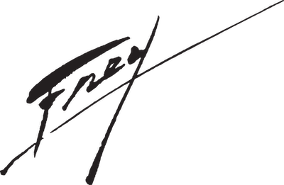
What stays and what goes is a constant dance in any rebrand campaign. The diagonal Frey signature logo, initially drawn by Paul Frey Sr., has become an emblem for quality and purity in the organic market. It is our cornerstone; what the customer who desires an exceptional, preservative-free bottle of wine reaches for in the wine section. The Frey logo endures!

Label design inspiration includes (clockwise from top left): Gottardo Piazzoni mural (“The Land”, 1932) at the de Young Museum of Art, San Fransisco; Late 1970s OP surf t-shirt graphics; The hills on West Rd, Redwood Valley; The abstract fractal painting of Hilma af Klint.
The Inspiration
Our graphic designer, Nicole Paisley Martensen, drew on both the natural world and how that gets interpreted in our California and collective history. She spent time photographing and sketching the undulating hills, muted colors, and leeward shadows of the hills surrounding our new winery location. "I wanted to create a true tribute, not only to our local environment, but to how landscape shapes the artistic visions in past eras," says Nicole.
Her creative inspirations for this project include artwork by Gottardo Piazzoni, Hilma af Klint, and 1970s surf and skate graphics.

A typeface inspired by old and new (clockwise from top left): Detail of bronze door, Bonanno Pisano, Monreale cathedral, Sicily, 1186; Part of the tympanum of St Foy, the pilgrimage church at Conques, in southern France, depicting heaven, 1130–35; Blue Curve VI, Ellsworth Kelly, 1982. Stedelijk Museum, Amsterdam.
The Typography
The intrinsic power of typography in marketing is immeasurable. Each minute detail of a letterform has the capacity to influence our mood and affinity with a product. "It was important to me to find the perfect fit that reads both elegant and casual, and has the potential to appeal to a wide audience," says Nicole
The new label updates the text's feel with a contemporary typeface, Alverata. Alverata is designed by Dr. Gerard Unger (1942-2018), a type designer and typography professor from the Netherlands.
Alverata draws inspiration from both the ancient and the modern: inscriptional Romanesque capitals and movements in the arts and design of the 20th and 21st centuries. This mingling of the old and new is at the heart of Frey's winemaking style.
Materials
The new Frey Organic labels are printed on GTree, a proprietary paper stock from G3 that uses 100% post-consumer waste recycled paper. Printed locally in Napa, our labels speak to our principles of putting the environment first.

The New Labels debut!
To Your Health!
We hope you enjoy seeing our new labels out on the shelves and on your tables! From our family to yours, we wish you the very best in all things that we want to convey with our new designs: good food, healthy living, gathering with friends and family, and sharing a sense of wonder for Mother Earth. Visit our shop to order a bottle with our new label.